Most of us have a pretty terrible understanding of history. Our knowledge is spotty, with large gaps all over the place, and the parts of history we do end up knowing a lot about usually depend on the particular teachers, parents, books, articles, and movies we happen to come across in our lives. Without a foundational, tree-trunk understanding of all parts of history, we often forget the things we do learn, leaving even our favorite parts of history a bit hazy in our heads. Raise your hand if you’d like to go on stage and debate a history buff on the nuances of a historical time period of your choosing. That’s what I thought.
The reason history is so hard is that it’s so soft. To truly, fully understand a time period, an event, a movement, or an important historical figure, you’d have to be there, and many times over. You’d have to be in the homes of the public living at the time to hear what they’re saying; you’d have to be a fly on the wall in dozens of secret, closed-door meetings and conversations; you’d need to be inside the minds of the key players to know their innermost thoughts and motivations. Even then, you’d be lacking context. To really have the complete truth, you’d need background—the cultural nuances and national psyches of the time, the way each of the key players was raised during childhood and the subtle social dynamics between those players, the impact of what was going on in other parts of the world, and an equally-thorough understanding of the many past centuries that all of these things grew out of.
That’s why not only can’t even the most perfect history buff fully understand history, but the key people involved at the time can’t ever know the full story. History is a giant collective tangle of thousands of interwoven stories involving millions of characters, countless chapters, and many, many narrators.
And you know humans—that’s not how they like things. The human brain really, really likes to simplify things. History provides the context of our world and our lives, because each of us is a character in this grand story—and the last thing we want to believe is that the story is too complicated and mysterious for us to understand.
Fairy tales are satisfying, because the plot is crystal clear—there are good guys and there are bad guys and there’s only one side of the story. Children identify with the good guys—the us guys—and they detest the bad guys—the them guys—and everyone’s happy. Stories written for adults aren’t that different—you loved Shawshank and Braveheart and Star Wars, right?
So when it comes to the story we’re all a part of, we most certainly want to feel the same way. We want history to be simple and clear, with good guys and bad guys, and we’d like to make sure that our ancestors, our ethnic group, our nation, and all the other tribes we belong to are Aladdin in the story—not Jafar.
The problem with this is that not everyone can be Aladdin. Someone has to be Jafar, right? Well, no. Not if there are many different story-tellers. Since no one is ever telling anything close to the full, real, complete story, in all its complexity—as we said, no one even knows the full story—each historian, each ruler, and each society creates their own fairy tale version of what went down in the past. When things are unsatisfyingly multi-faceted, we pick the facet we like best. When there are knowledge gaps, we make things up. When there are questions of motive, we pick one that fits nicely into the narrative.
This leaves us with plenty of tools to leave every story with a proper Aladdin and a proper Jafar and allows us to make sure that Aladdin is exactly who we want him to be.
The US is a good example. A huge number of people in today’s world have been told a story of the US in which the US is Aladdin, and a huge other number of people have heard the same story with the US as Jafar. Some people will claim to have a more nuanced view, but deep in their heart, when they see an American flag, they see either a good guy flag or a bad guy flag. (One of the major political divides in the US stems from liberals thinking conservatives over-Aladdinize the US and conservatives thinking liberals over-Jafarify the US while Aladdinizing the other side.)
This is the same phenomenon behind the stark opinion divide around Israel and Palestine. Hordes of people on both sides of what is an insanely complicated story are red in the face with ire at the other side, completely positive that their side is Aladdin and incensed that anyone could ever call the other side Aladdin and their side Jafar. Only with the stark clarity of a fairy tale could people ever feel so unshakingly sure.
Of course, it’s not that there are no good guys or bad guys in history. History is a pretty ugly story—what else would you expect from a species of primitive biological animals—and accountability for that ugliness isn’t spread out evenly amongst all people. To an extent, the definition of words like good and bad, right and wrong, and hero and villain lie in the eye of the beholder—but there’s also plenty of human behavior that qualifies as objectively good or bad.
So it’s not that there are never objective Aladdins and there are never objective Jafars—it’s that almost none of us has any idea what the fuck we’re talking about. Point to a historical event and tell me that there was a true Aladdin and Jafar going on, and I’ll acknowledge that that might be true. Tell me that you know who was who, and in most cases I’ll shake my head.
Which brings me to me. Blogging about history is asking for trouble. Portray nearly any story or person as an Aladdin or a Jafar and you’ll feel the wrath of both the people who believe the opposite situation and the people who think you’ve oversimplified the situation. Portray something in a nuanced and balanced way and you’ll get yelled at by people who believe both of the one-sided views. Nothing brings people’s tribal fires to the table like history. I’ve learned this from experience.
This doesn’t make me any less excited to write about history—but it makes me want to research the shit out of a part of history before I write about it. Only by reading a bunch of varying accounts and opinions can you start to form a clear picture of what we know and don’t know.
So that’s why for this post, I’m not gonna tell you shit. Rather than dive into the weeds of what happened when, and why, I’m going to focus on one of the rare elements of history that’s indisputably black-and-white—who happened when.
Because before we can responsibly start arguing with each other about Aladdins and Jafars, we need to get the basic timeline and characters of the story clear.
But I’m going to lay things out a little differently than you’re probably used to.
Normally, we learn about history’s storylines in isolation. We might have a strong sense of the history of physics breakthroughs or the progression of western philosophical thought or the succession of French rulers—but we’re not as clear on how each of these storylines relate to each other. If you think of history like a tangle of vines growing upwards through time, studying one type of history at a time is like following the path of one particular vine while ignoring the other vines around it. It’s understanding history in a vertical sense.
And while vertical history has its merits, it doesn’t leave you with an especially complete picture of any one time. An econ buff in the year 2500 might know all about the Great Depression that happened in the early 20th century and the major recession that happened about 80 years later, but that same person might mistake the two world wars for happening in the 1800s or the 2200s if they’re a little hazy on the history of wars. So while an econ buff, that person would have a pretty poor understanding of what our modern times are all about.
Likewise, I might know that Copernicus began writing his seminal work On the Revolutions of the Celestial Spheres in Poland in the early 1510s, but by learning that right around that same time in Italy, Michelangelo painted the ceiling of the Sistine Chapel, I get a better picture of the times. By learning that it was right while both of these things were happening that Henry VIII married Catherine of Aragon in England, the 1510s suddenly begins to take on a distinct personality. These three facts, when put together, allow me to see a more three-dimensional picture of the 1510s—it allows me to see the 1510s horizontally, like cutting out a complete segment of the vine tangle and examining it all together.
A blog post is limited in its ability to examine all of history horizontally. But I’ve taken two separate cracks below that I think can work together nicely to help us take a horizontal view of different times. Both involve a lot of names.
Which leads me to the inevitable disclaimer about who I chose to include. I tried to remove my own biases by gathering the names from a handful of lists by publications like Time. I searched the internet for things like “most influential people in history” and “most important people in the Middle Ages” and “most famous people of the 19th century” and “most powerful Chinese emperors” and ended up with a big pile of names, some of whom I’m familiar with, others I’m not. That said, between the fact that the lists I used were by publications targeting English-speaking people and that I inevitably leaned more towards people I had heard of, the group of names will skew America- and Euro-centric, with places like Africa, the Middle East, and Southeast Asia probably underrepresented. This isn’t entirely by accident, though—this post is only useful if you’ve heard of the people, and I intentionally chose names I thought a large portion of Wait But Why readers would know. In other words, merit wasn’t the only criteria—household fame mattered too. And yes, I missed a lot of people—with limited space on the screen, the names had to be a sampling, not an exhaustive list.
Horizontal History—First Crack:
For my first crack, I present to you a big pile of famous names, organized by birth decade—kind of a “2,600 Under 2,600” list. The purpose is to help orient ourselves on when people lived, especially in relation to each other.
Having a clear picture of generations is very easy when you think about currently-living people. For example, I know that Mark Zuckerberg is around my age while Vladimir Putin is about the age of my parents and George H.W. Bush is about the age of my grandparents. On the other side of things, Prince George—the one world-famous baby—is the age of my kids if I had kids. I know this without having to think about it:
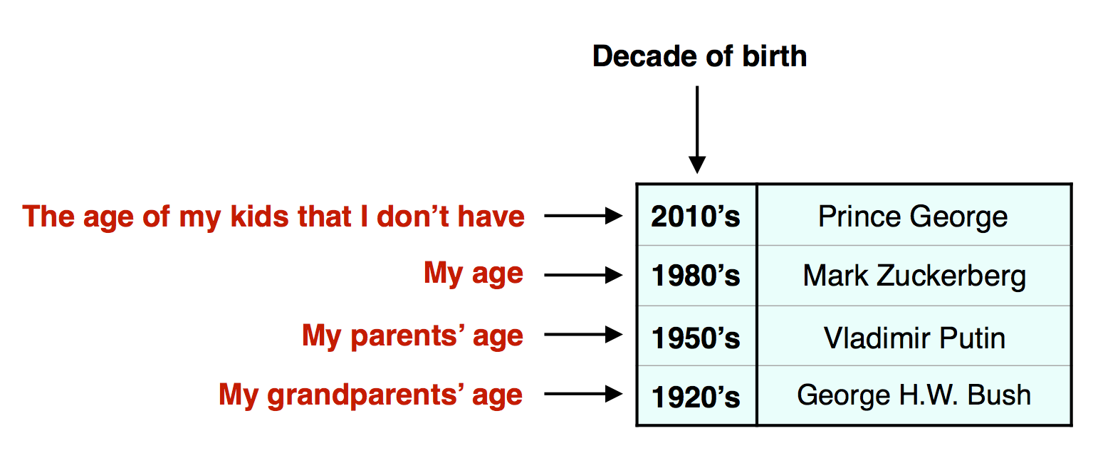
If I list people by birth decade instead of generation, it still makes sense. People born in the 70s and 60s feel older than me but not as old as my parents, and people born in the 30s and 40s feel older than my parents but younger than my grandparents:

But this is much harder for generations that aren’t currently alive, and it gets less and less clear the farther back you go. Quick! Name the oldest member and youngest member of this group: Nietzsche, Darwin, Freud, Marx, Gandhi, Tolstoy, Twain. Not that easy, right? And that’s only going back 200 years. But by laying them out by birth decade, you can get oriented:
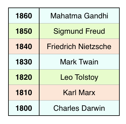
Since a generation is typically about 30 years, you can move three or six lines down from a name to see who they viewed as their parents’ or grandparents’ ages during their lifetimes, and you can go the same distance up to see who they viewed as their kids’ or grandkids’ age. So Darwin would have seen Twain as some young kid and he would have shaken his old man fist at Gandhi from the rocking chair on his porch. Meanwhile, Nietzsche would have seen Marx as a guy his dad’s age and Freud as a contemporary, though a bit younger.
Two people more than seven or eight lines away from each other on the list probably were not ever alive at the same time, which means they were likely not that clear about each others’ generation, in the way I’m not really clear on whether Hemingway was in my great-grandparents’ generation, my great-great-grandparents’ generation, or some other age.
Using this decade list tool, let’s look at a whole group of famous historical figures to see who was the same age as whom, who shook their old man fist at whom, and who was and wasn’t alive at the same time. The decade colors are in a three-way cycle, so you can jump to rows of the same color above and below to quickly go up and down by generations (i.e. if you take a name on a green line, one green line down is their parents’ age, three green lines up is their great-grandchildren’s age, etc.). For people alive today and in the past century, I couldn’t come close to including every famous person, so I just picked a sampling.
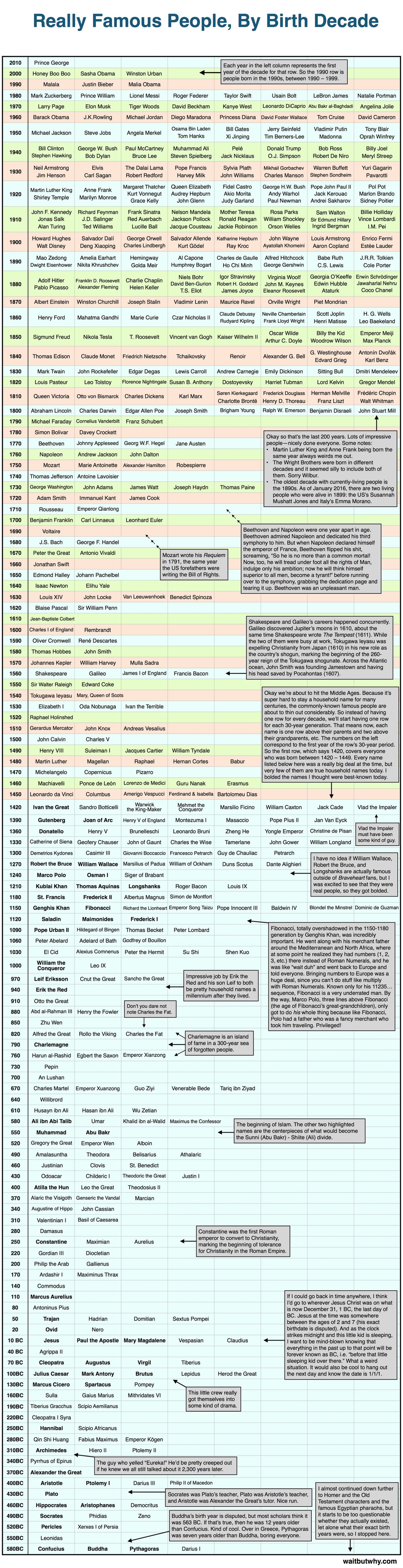
Okay how did that go? Fun? Icky? I can’t quite tell. In any case, let’s move on.
Horizontal History—Second Crack:
For my second crack at depicting history horizontally, I present to you A Psychotic Jumble of Colorful Vertical Bars That Might Be Awesome or Maybe Not I Can’t Tell Here Either But I Think It Might Be Fun.
This time, I got more specific than birth decade and actually identified the exact birth year and the death year of each name, using a bar to depict their lifespan. While the above chart simplifies who lived when, the diagram below allows you to follow a single horizontal path along any year and see who was and wasn’t alive at that time.
As I made the diagram, I ran into a big problem, which is that it looked like an upside-down L with way more names at the top than the bottom (because there are a lot more household names who were alive in the last 200 years than in previous centuries). Crunching all those recent names into blog width made the font tiny—so I solved the problem by cutting out about half of the recent names. But, before I did, I broke the complete list of 1800–2016 names into two groups by category and here they are below:

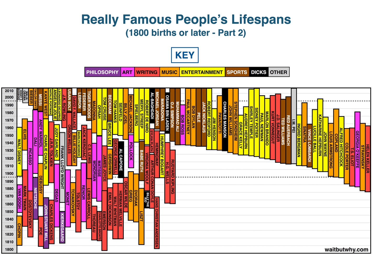
Okay now that that’s out of the way, here’s the big list (with only half of the total 1800–2016 names included). It goes back to 1450. Trace a horizontal line across to get a feel for what was going on during that particular time.
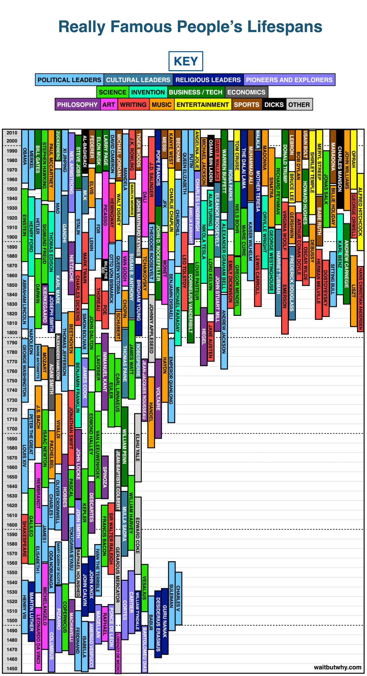
Some overall thoughts:
- Lifespans are unfair. Looking at people’s lives visually really makes it clear when two people are born around the same time but then one of them randomly dies 30 years before the other.
- Murder is dickish. Another thing this diagram highlights. How not okay is it to cut someone else’s bar short? JFK might have been on his way to a nice 85-year bar when this other guy just took a scissors and snipped his bar.
- On the other hand, short lives were appreciated during the making of this diagram. This was a nightmare of a puzzle, especially at the top, and while trying to fit a lot of bars into a small space, there were times I found myself saying, out loud, “Oh nice,” when I’d look up someone’s life dates and realize that they were murdered at a young age. Likewise, one factor that led to a number of the recent people being cut from the big diagram was living too long. Frank Lloyd Wright’s a cool dude, but not 2.5 inches of diagram cool.
- Some people aren’t easily categorized. I tried my best. You try putting Ben Franklin into a category.
- Yeah, yeah, I said the whole “Aladdin and Jafar are in the eye of the beholder” thing and then I created a category for people who I deemed dicks. I know. But it was fun to label certain people as dicks. Ya know?
Each little part of this diagram tells a story. Let’s go through a few examples:
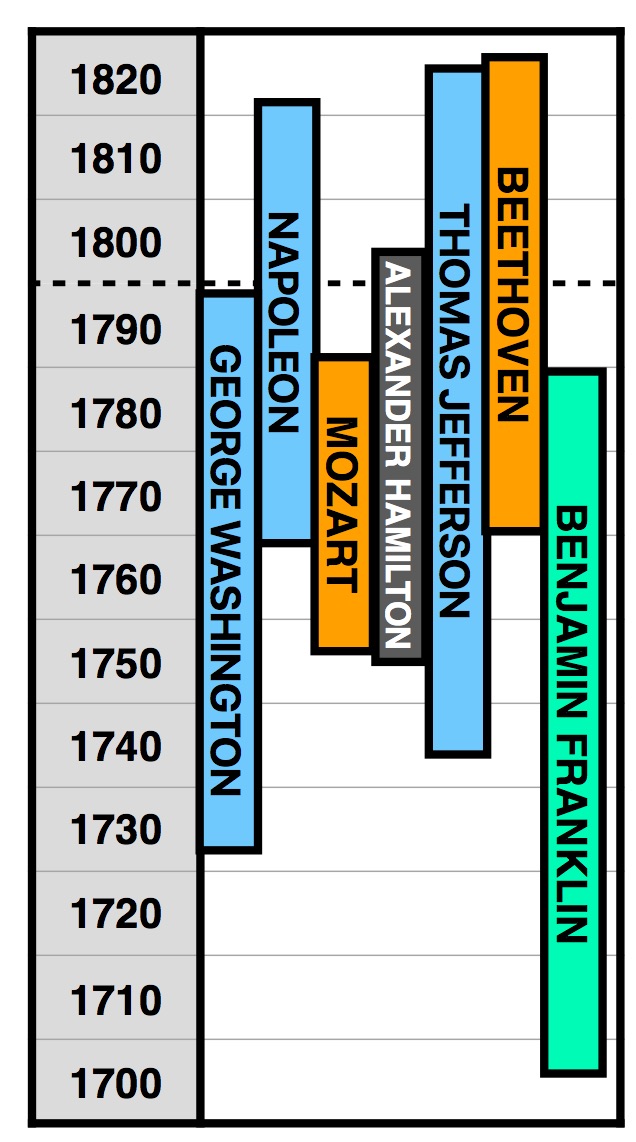
I mentioned in a box in the first chart that Mozart wrote his Requiem the same year the US forefathers were writing the Bill of Rights and that Beethoven had a love-hate relationship with Napoleon—but using the lifespan diagram, you can see both of these stories visually.
I also mentioned the major Shakespeare, Galileo, Tokugawa, and John Smith events that all happened right around the year 1610.

And in the intro, I referenced Copernicus’s seminal work happening right when Michelangelo was painting the Sistine Chapel ceiling and Henry VIII was marrying Catherine of Aragon.

But if you look at the other stuff the diagram shows going on around that same time, it tells a bigger story:
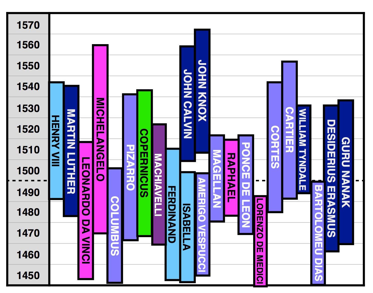
While Copernicus, Michelangelo, and Henry VIII were happening, it was also the golden age of European exploration—look at all those light purple explorers!—and the precursor age to the oncoming Age of Imperialism. Simultaneously, you can see the Protestant Reformation brewing with the presence of all those dark blue religious figures. The one dark blue exception is Guru Nanak, who was over in Asia being the founding prophet of Sikhism (today’s 5th biggest religion). Meanwhile, Michelangelo was part of something larger, as the other pink bars—and Machiavelli—remind us that the Italian Renaissance was in full swing.
Every time I look at the lifespan diagram, a new interesting horizontal pops out to me. Here’s one more: People in the US associate the 1860s with Lincoln and the Civil War. But what we overlook is that the 1860s was one of history’s greatest literary decades. In the ten years between 1859 and 1869, Darwin published his world-changing On the Origin of Species (1859), Dickens published A Tale of Two Cities (1859) and Great Expectations (1861), Lewis Carroll published Alice in Wonderland (1865), Dostoyevsky published Crime and Punishment (1866), and Tolstoy capped things off with War and Peace (1869). These guys were all in their primes at the same time. So was Lincoln, before some cock snipped his bar off at the worst time possible.

So there’s some horizontal history for you. Now go brush up so we can all be oriented the next time we yell at each other about fairy tales.
___________
More Wait But Why history posts:
From Muhammad to ISIS: Iraq’s Full Story – written after my visit to Kurdish Iraq
Putting Time in Perspective – a diagram to help visualize everything that happened between the Big Bang and now
The Death Toll Comparison Breakdown – a diagram to put famous death tolls in perspective
The American Presidents series
_______
If you like Wait But Why, sign up for our email list and we’ll send you new posts when they come out.
To support Wait But Why, visit our Patreon page.